Designing Across Hardware & Software
Product Ecosystem
2021 - 2023
Making a bottle cap and a mobile app feel like one coherent product, from first unboxing to daily use.
My role
I designed the full digital experience. I owned the iOS and Android hydration app from first prototype to production, defined the LUCY brand identity, the packaging, and built the web product pages.
On the hardware side, I worked with engineering and the PM to shape the physical interface: button interactions, LED communication states, and calibration feedback.
Impact
28k+ caps sold · 91.6% pairing rate · Red Dot Award 2022
One button, a ring of LEDs and an app to carry everything else.
It was waterdrop's first connected product: a consumer goods company designing hardware and software simultaneously, with no existing playbook for either.
Research showed that every bit of friction led back to tracking reliability.
The research programme ran across six markets before launch: 1,000+ surveys, 14 interviews and 30 diary studies covering onboarding, design quality, habit formation, and reliability.
The finding that shaped the most decisions: all four were connected. Reliability issues created habit problems. Habit problems made the onboarding feel worse than it was.

The product isn't finished until a customer uses it.
Batch testing ran across four rounds before launch. By Day 7, UV-C purification was the most-used and most-valued feature, rated 8.2/10 for reliability. Hydration tracking scored 7.4/10.
The gap flagged something important: the tracking hardware had constraints the design couldn't fully resolve, which shaped how the app was built. Three decisions came directly from the test results.
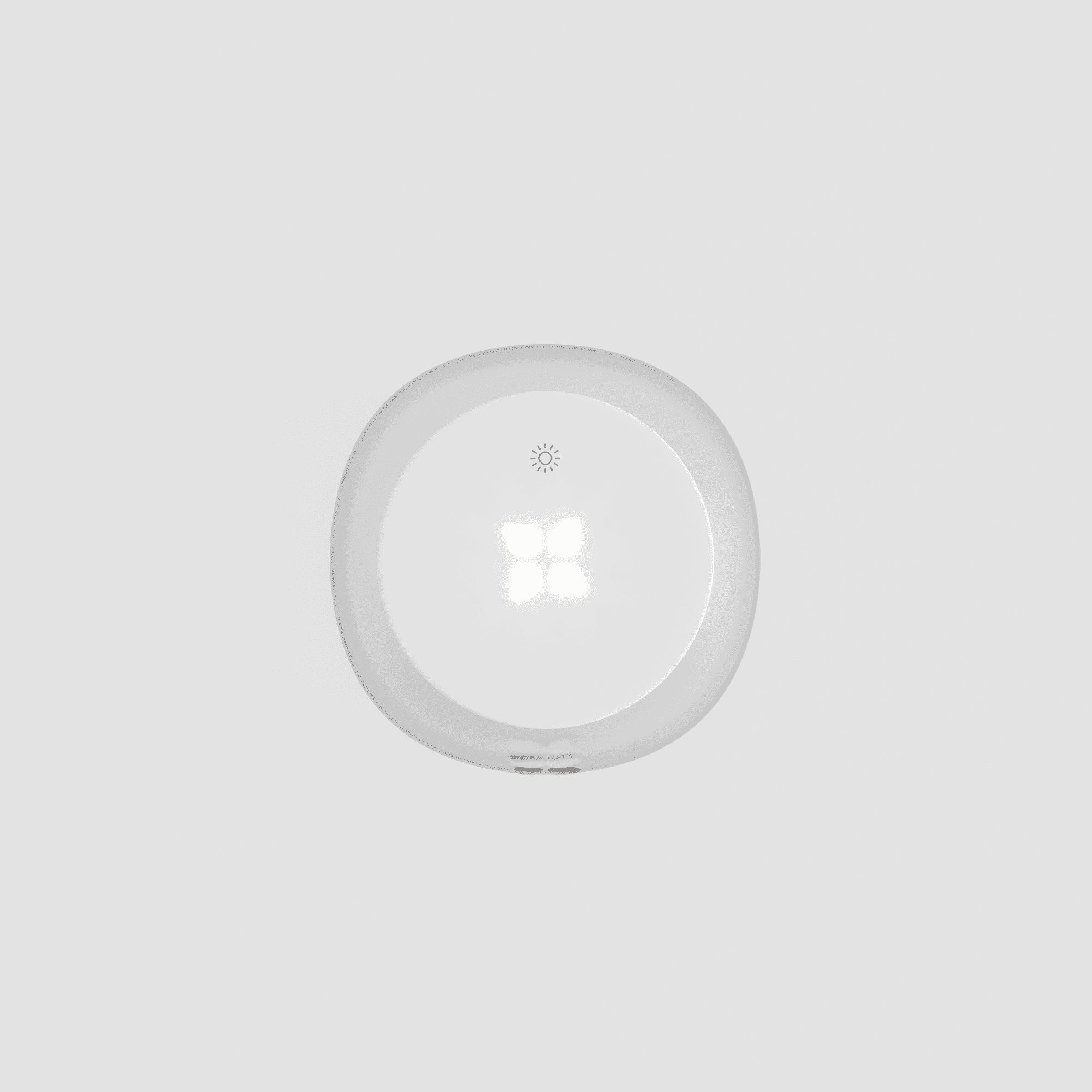
A simplified product interface: using just one interaction language across the whole product.
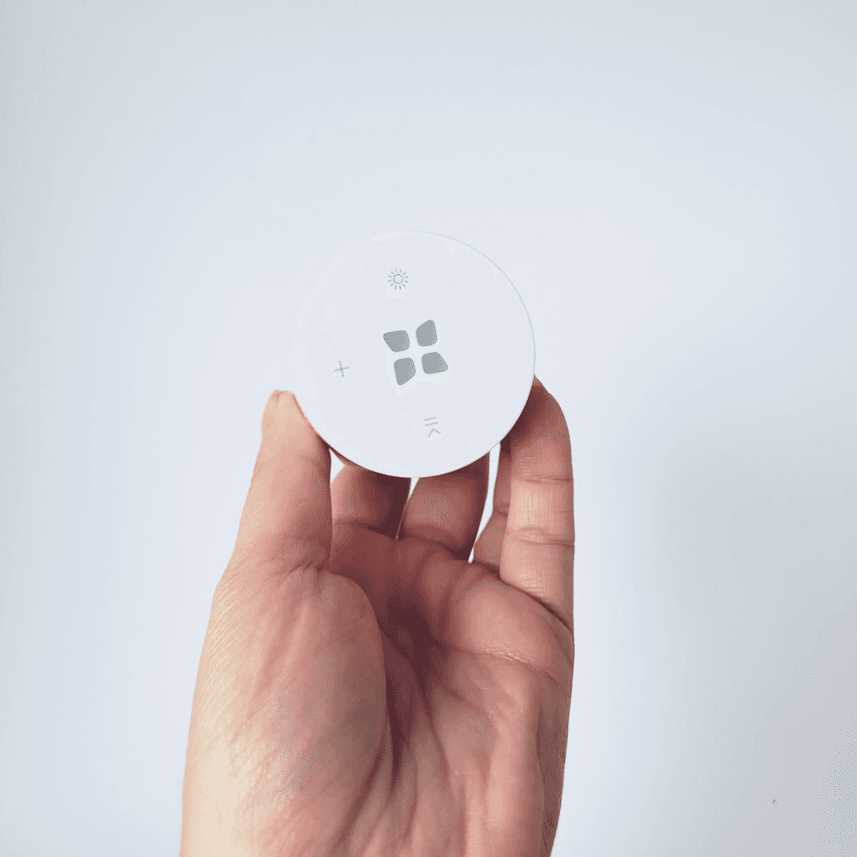
56% of batch testers found three buttons confusing. The Play/Pause button was the worst offender: most testers in the first batch had no idea what it did. The interface was simplified to a single multi-purpose button with distinct touch interactions.

Reduced the number of colours from six to three to reduce cognitive load.
46% of batch testers were confused by the number of colours LUCY used to communicate. The signal system was reduced to three: one for connection status, one for drinking reminders, one for UV-C cleaning. Less to remember, faster to read at a glance.

A better unboxing is still part of the product experience
The original packaging was round, which created a vacuum effect when opened. The thick cardboard made it worse: some users had to physically tear it apart to get inside. I redesigned it from scratch: square format, structured opening, no vacuum issue.

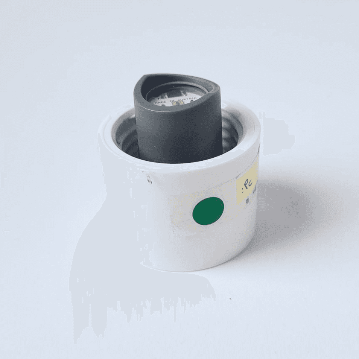
Early hardware prototype. At this stage, we were still testing basic form factor before any surface finishing.
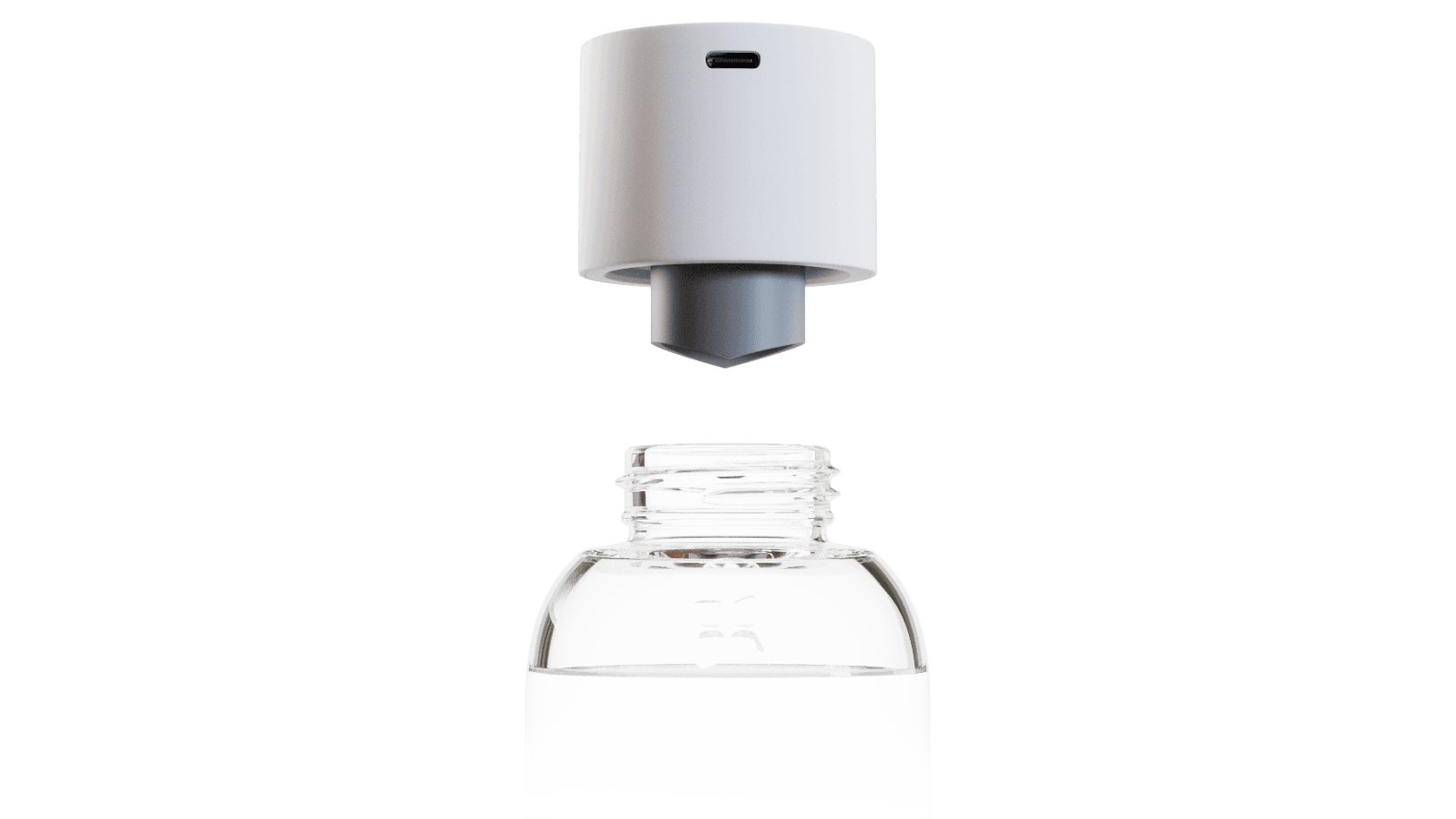
One of the first physical prototypes. The USB-C port position and internal layout were still being worked out with the hardware team.
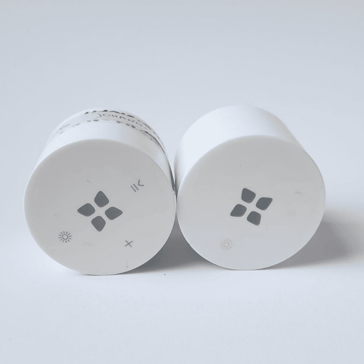
V1 and V2 interface side by side. Three touch icons reduced to one after 56% of batch testers found the original confusing.
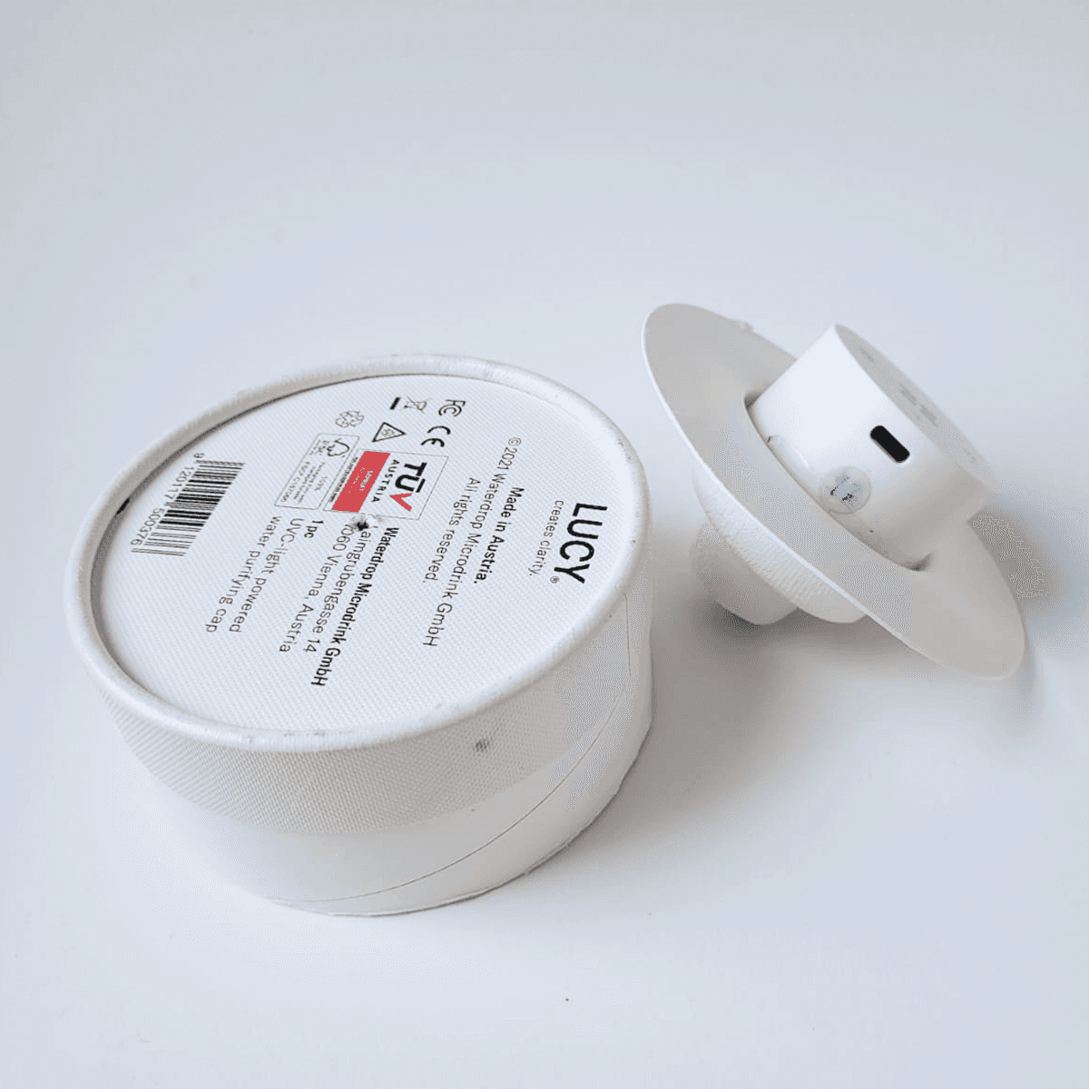
The original packaging. The round shape created a vacuum effect when opened; some users had to physically tear it apart.
Designing the digital product
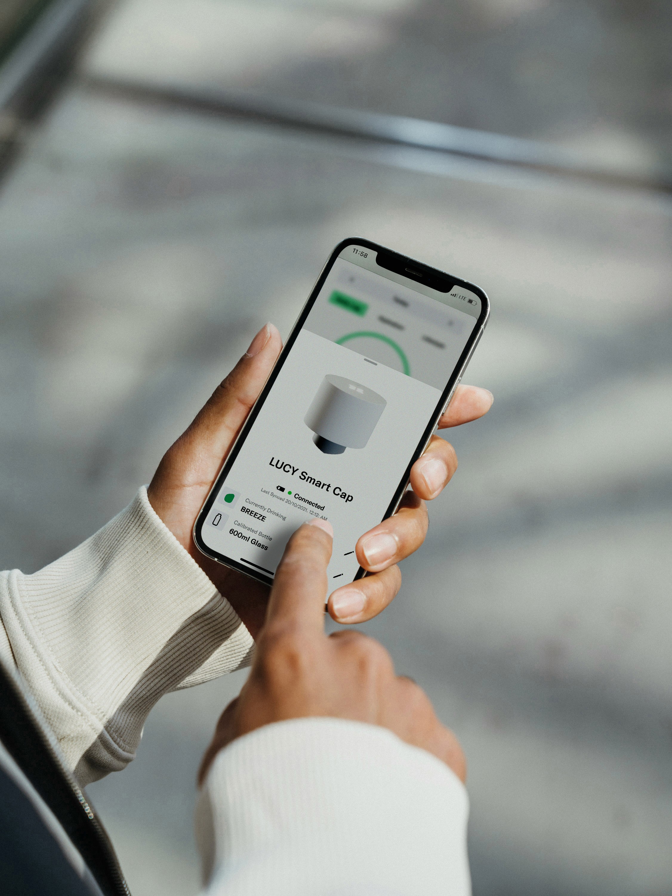
When LUCY launched, the hydration app launched with it. The app had been rebuilt from scratch in the year before: the original agency build had a single home screen and a failing architecture. V2 was designed in parallel with LUCY's hardware development, over the course of a year.
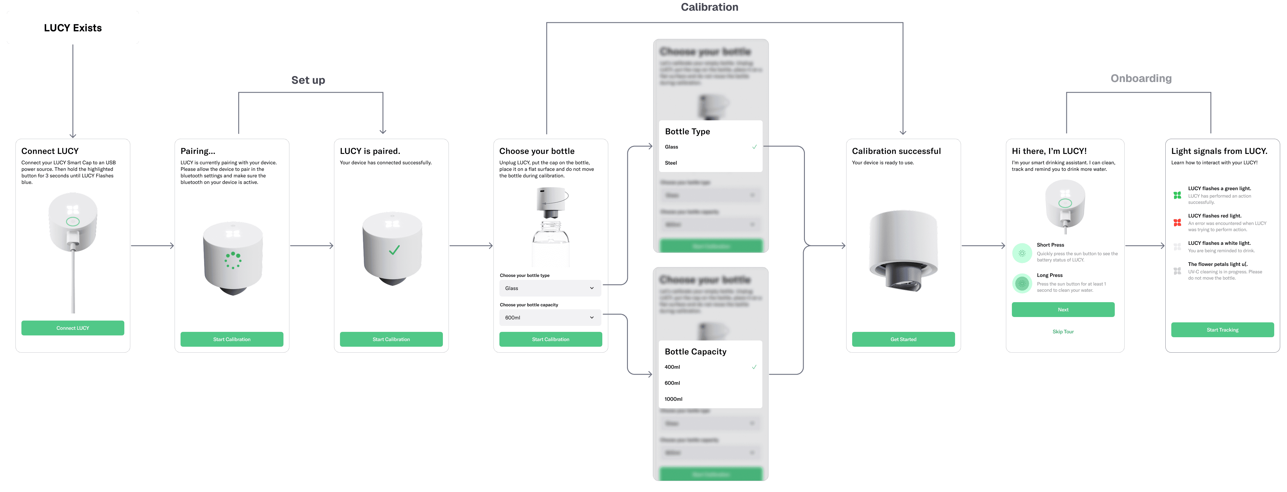
Designed a structured pairing flow to guide users through setup and calibration.
Most users assumed LUCY would work with any bottle out of the box. It didn't. Accurate tracking required calibration: choosing bottle type and material before the cap could calculate volume.

Building an app for resilience: offline first.
Measuring accuracy and unstable connection were the two most-cited post-launch complaints, flagged by 28.4% and 24.8% of LUCY users.
Both were hardware constraints. The app was built for resilience: a functional standalone tracker first, with LUCY data layering on top when available.
Positioning the LUCY Cap as the retention accelerator.
Smart Cap users earn double points across all gamification activities. The longer someone uses LUCY, the faster they advance. Hardware adoption and app engagement pull in the same direction.

Launch and impact
LUCY launched on 19 January 2022 and won a Red Dot Award the same year. 28k+ caps sold across six markets, and 91.6% of them were successfully paired with the app - validating both the onboarding flow and the physical setup.
Post-launch surfaced pairing and calibration issues, both hardware constraints, addressed through better in-app communication. 30-day retention improved from 9.3% to 18.5%. App users spend 19.3% more per order.
28k+ caps sold in the first year
waterdrop's first connected product, live in six markets from January 2022.
91.6% pairing and onboarding rate
Almost every cap bought completed setup and calibration in the app.
Double the 30 day user retention
From 9.3% to 18.5% (among app users with a paired cap).
Winner of the Red Dot Award 2022
Recognised as one product: hardware, interface and app together.
Reflections
Designing across hardware and software means accepting that some user problems are outside design's reach. The diary studies across 30 users told us a great deal about habit formation but they didn't tell us enough about first use. The moment a customer takes LUCY out of the box alone, with no one to help calibrate it, was the question we should have asked first.
If I were starting again, I'd get involved in hardware decisions earlier and test that assumption before launch. The expectation that LUCY worked straight out of the box was discoverable, we just didn't get there in time.

©2026 Teodora Gheorghe